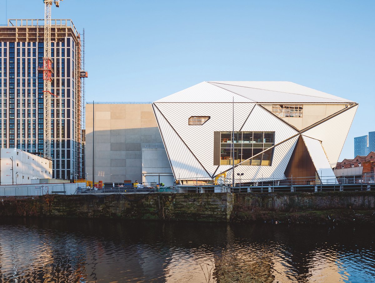
Four years late and £100m over budget, the construction of Manchester’s Factory International has not quite gone to plan—but its soft opening on 30 June is still hugely anticipated. The site, once famous as the birthplace of modern industry, seems to do residential investment much better than culture. Yet Factory International is undeniably taking shape: a big, clunky blockbuster of a building to give the Manchester International Festival (MIF) a purpose-built home. And, surely, all the best buildings go a bit over budget?
The £211m Factory International, the largest public investment in a UK cultural project since the opening of Tate Modern in 2000, aims for that Modernist dream of a multi-purpose cultural venue, situated somewhere between concert hall, gig venue, festival, theatre and art space. It is a hybrid that has long been imagined and only rarely successfully achieved. But perhaps architects OMA, founded by Rem Koolhaas in London in 1975, can pull it off. OMA’s extraordinary Taipei Performing Arts Centre, which opened last year (seven years late, 100% over budget), has been a huge success: a genuinely popular, radical venue, open, accessible and well used.
Most of the attention on Factory International (apart from its inflating budget) has coalesced around its possibilities for performance: for music, dance and theatre. There is perhaps slightly less emphasis on the visual arts, although the opening event in June will be Yayoi Kusama’s largest ever immersive environment, a piece conceived specifically with the building’s vast spaces in mind. You, Me and the Balloons opens on 30 June (until 28 August) and is billed as a “journey through Kusama’s psychedelic creations—many over 10m tall—including giant dolls, spectacular tendrilled landscapes and a vast constellation of polka-dot spheres”.
Although Kusama’s work is enormously over-exposed—it is difficult to go to a museum or an upmarket shopping street without encountering it—she remains genuinely popular, and her work is hugely appealing to those posting on social media.
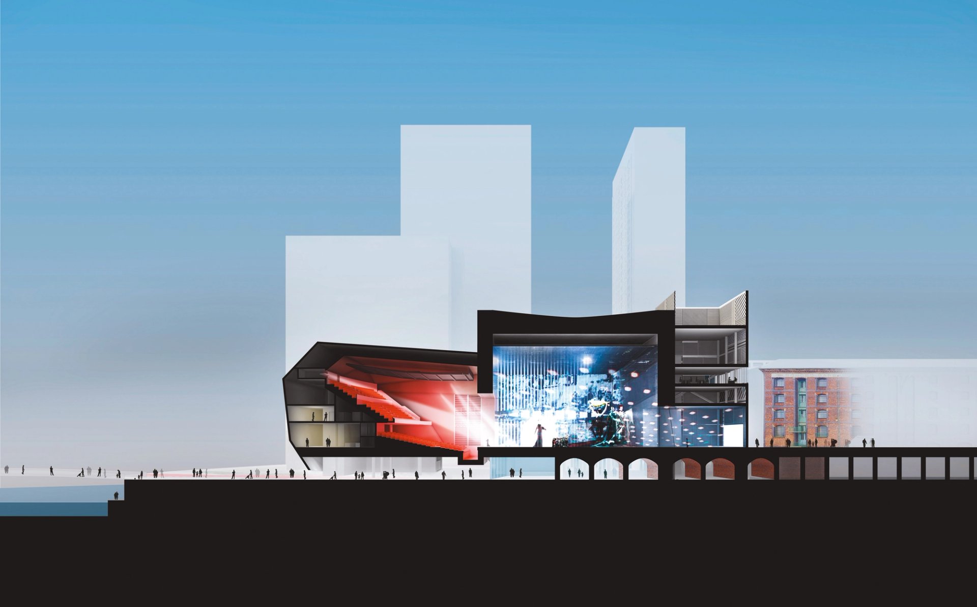
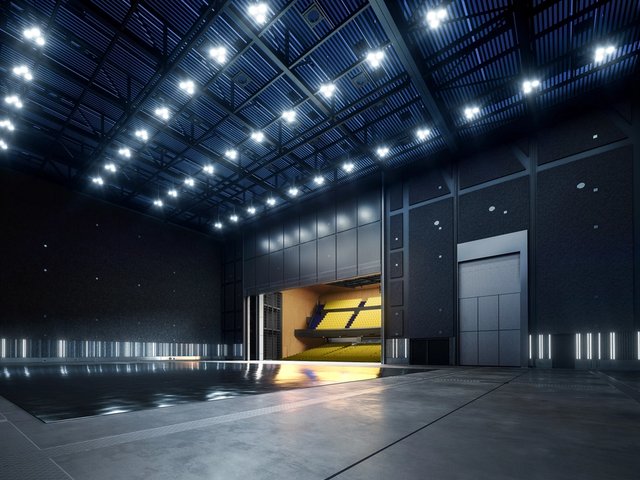
Factory International will operate as a multi-purpose cultural venue, and includes a 1,600 capacity auditorium and a main space that can be sub-divided OMA
Designed as a home for the hugely successful and admired Manchester International Festival, Factory International was required to accommodate almost any conceivable artistic medium, in what sounds like a tricky brief for any architect. “Not at all; in fact, it was our dream,” says its designer, Ellen van Loon of OMA. “It was very short—one sheet of A4—but the client was asking for exactly what we’d always dreamt of building. It was a match made in heaven.”
“The user here is a special one,” Van Loon says of the MIF. “They are creating and initiating new projects all the time and often in combinations no one would ever have thought of, like opera and hip-hop. So, you can only design in this way, the way that we like—with no boundaries.’
John McGrath, the MIF’s artistic director, says that the building is “designed to replicate the kind of architectural excitement we’ve had in sites like the [former railway yard] Mayfield Depot, but in an environment that has far greater technical capacity.”
“It maximises the choices for artists,” McGrath says. “For example, our main warehouse has a full theatrical grid across its 64m by 34m spread—so artists can place their work, and their audiences, at any point or place in the space. We’ve tried to design a space that allows artists to think in new ways about how work can be shaped and structured.”
Dream of flexibility
Is there, though, a hubris associated with that dream of flexibility? Can you end up with a building as jack of all trades but master of none? “Cultural buildings are quite expensive,” Van Loon says. “This is not the only one to have gone over budget, and if so much public money is being spent, you have a responsibility to use it to the maximum.”
“Artists in general are working across a wide range of media,” McGrath points out. “Our space doesn’t ask them to decide in advance which area of their practice they want to focus on, in the way a gallery or theatre space does. It invites them to start with a proposition and idea, or a question, and to explore what form will work best for that idea.”
The building is a curious-looking thing. (Van Loon quotes back to me my own description as “strikingly unlovely” with a raucously self-critical laugh.) The pursuit of beauty has never been OMA’s pursuit, although this rather lumpy-looking structure seems radical in its aesthetics—even for them.
Sited between the River Irwell, an early railway line, a few remaining Victorian warehouses and a fast-rising mass of developer housing blocks in the city’s St John’s branded neighbourhood, Factory International looks like a piece of architectural nominative determinism. McGrath talks of being inspired by “the messy skyline and streetscape of Manchester, where styles clash into each other unexpectedly, and often productively”.
Van Loon says that she “wanted to keep the industrial feeling of that part of Manchester—not just the brick warehouses, but the more modern buildings, industrial sheds and big boxes apparently built without any architectural thought”.
Certainly, the sheer scale of the building suggests a hangar or an assembly plant for something big. There is a 1,600 capacity auditorium—The Hall—but the main space, The Warehouse, is a colossal concrete room with moveable partitions allowing it to be sub-divided if required. The interior incorporates part of the early 19th-century railway viaduct, subsuming the area’s history into its fabric. But its absorption of local history goes much further, down to its very name. “We were very conscious of that history, the record label, the Haçienda, the music I grew up with, like Joy Division,” says McGrath.
Homage to the Haçienda
In a nod to that heritage, Ben Kelly, the designer of the original Haçienda club in 1982, which was constructed in the language of building sites and industrial spaces, has been commissioned to design some of Factory International’s interiors. Peter Saville, one of the founders of Factory Records and the man who gave its sleeves their distinctive identity, is also involved in creating the graphics for the building.
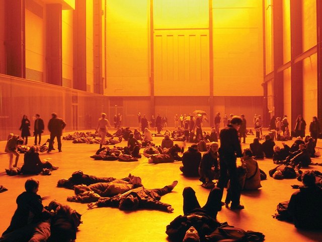
But how might it really work as a space for art? A huge installation by Kusama is one kind of spectacular, but what else is there? “I didn’t want it to be another Turbine Hall: a space with a big installation in the middle,” Van Loon says, referring to Tate Modern’s huge industrial volume. “Instead, we wanted a space where you can experience a work of art being made, where things are created in front of you and around you. Art has become so precious that it is hidden away in vaults or behind glass, almost in laboratory conditions. We wanted something where you could reach out and touch it: a factory for art.”
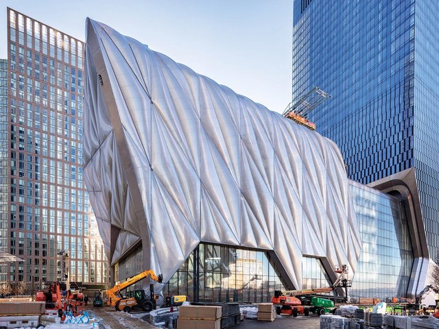
The building’s design has changed, from a more transparent, almost tented thing—like objects in a pair of white tights—to become more robust and angular. “That’s because this is an increasingly residential area,” van Loon explains. “It’s all to do with acoustic insulation, so that the events can go on for 24 hours without complaints from the residents.”
There was another Dutch designer, Constant Nieuwenhuys, whose most famous work, New Babylon, was a conceptual, post-industrial complex in which the pursuit of leisure was everything. In his thinking, an infinitely reconfigurable landscape provides an armature for this new urbanity. Nieuwenhuys was a Situationist, and it was that movement that so influenced Tony Wilson, the founder of Factory Records, in his conception of Manchester as a new cultural cityscape. Even the Haçienda’s name was taken from a text by a Situationist, Ivan Chtcheglov.
The Haçienda was demolished and replaced by a block of flats with the same name. Popular culture consumed by commerce. The job of Factory International will be to hold out against such a thing, to maintain its presence. It looks tough enough.


