When it was created in 1929, the Museum of Modern Art (MoMA) was radical: the first institution in North America devoted to avant-garde modern art. The founding director, Alfred H. Barr Jr, who led the museum for 14 years (and stayed on for another quarter century), conceived of it as a laboratory, a place of experimentation and risk taking.
It can be hard to square those roots with the MoMA of the present day: a wealthy, corporate behemoth that has spent nearly a century expanding. Architecturally, the institution long ago outgrew its original townhouse and has since helped to “transform 53rd Street into what is today a canyon of glass and steel that can bring to mind the headquarters of Darth Vader’s hedge fund”, in the words of the New York Times’ Michael Kimmelman. Such an ominous analogy also speaks to mounting ethical concerns and protests at the museum over the financial dealings of two of its trustees.
MoMA reopened on 21 October after a four-month closure and a $450m expansion that adds 102,000 sq ft (around 9,500 sq m), nearly half of which is gallery space. Designed by Diller Scofidio + Renfro with Gensler, the renovation does not change the commercial, almost soulless, feeling of the place, especially with political conflicts brewing in the background. But it has given us, at least so far, a much more interesting institution than the one to which we bade farewell in June. For New Yorkers and droves of tourists, that is a win.
About those droves: it remains to be seen how much they will fill the new MoMA and how jammed it will feel. I suspect very. Judging by the lobby’s long ticket counter, in front of which stands another line of automated ticket machines (Kimmelman compared the revamped entrance to an Apple store), the museum is expecting a lot of visitors. And why not? “The new architecture expresses the logic of perpetual growth,” wrote Justin Davidson in New York magazine. “Denser crowds bring more money, which buys more art, which requires more space, which demands more money and bigger crowds.”
Will those crowds know where to go when they arrive? I am not sure. The new floor plan flows well enough once you are upstairs, but standing in the vast lobby, there is little indication that the primary attractions lie west, in a space that didn’t exist before. Off to the east, where the axis of the museum used to be, the old escalators and even the sculpture garden now feel like an afterthought. The effect is imbalanced, so that the few remaining galleries on that side of the mega-building seem marginalised.

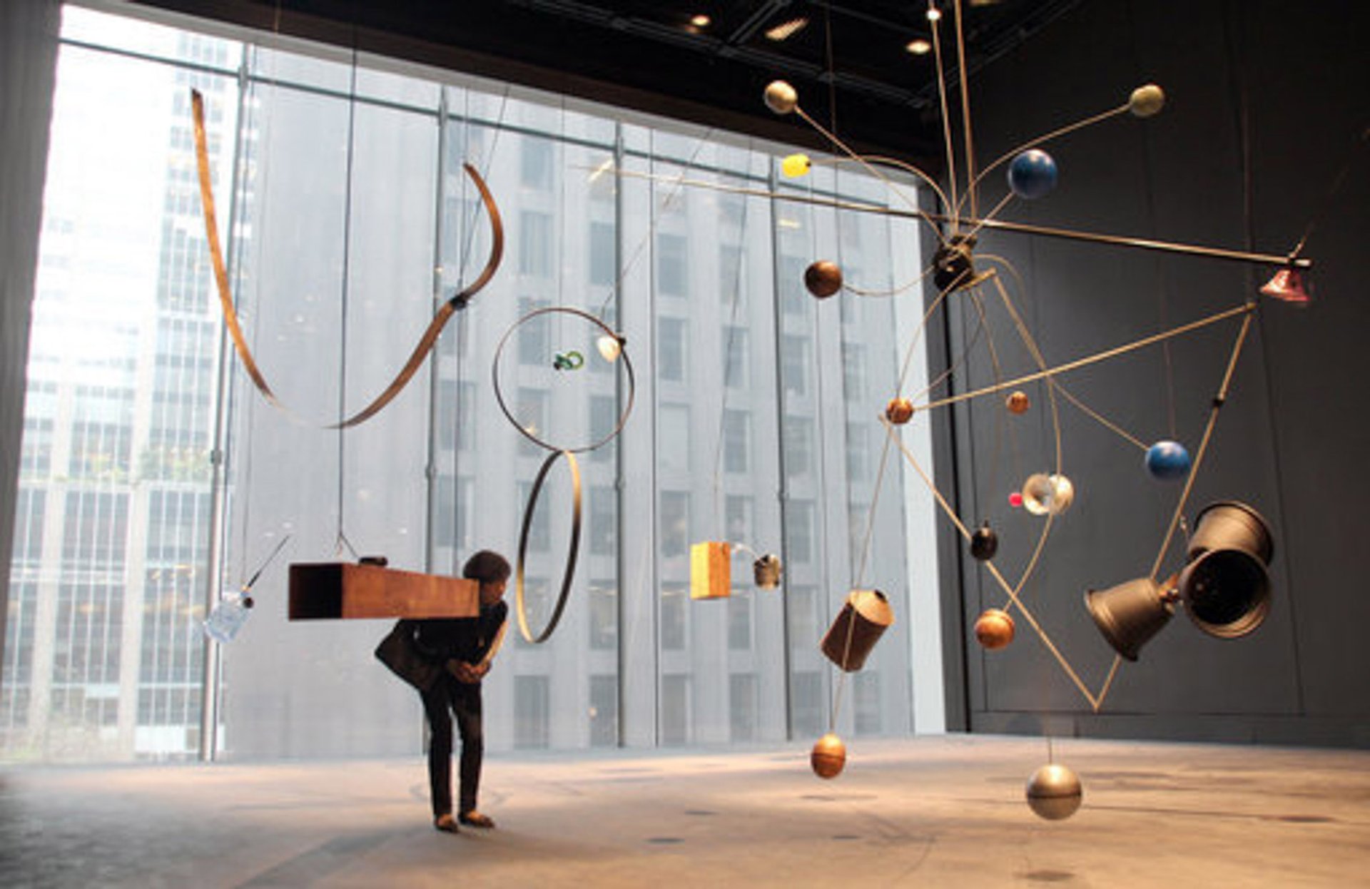
Rainforest V (variation 1) (1973-2015), an installation by David Tudor, activated by the performance Forest Speech (1978/79) by Composers Inside Electronics Inc, can be seen in the Museum of Modern Art DPA/PA Images
Imposed monumentality
On the bright side, they may prove quieter than the permanent collection spaces, which, perhaps inevitably, appear only partly equipped to handle crowds. The big second-floor galleries devoted to contemporary art, where a lot of the work suffers from a kind of imposed monumentality, will be fine. But making my way through the denser, more interdisciplinary spaces of the fourth and fifth floors, which cover the collection from the 1880s to the 1970s, I could already envision bottlenecks forming to use the stereoscopic photo viewers or to get a good look at—and a good picture of—Frida Kahlo’s Self-Portrait with Cropped Hair (1940). And it goes without saying that there are not many places for visitors to rest within the galleries. In keeping with the hostile trend in art spaces, benches and other seating are sparse.
In many ways, I suspect the new MoMA building will be a lot like the old MoMA building—which is part of the plan, of course: when your museum is a major tourist attraction, why mess with it too much? To the curators’ and institution’s credit, however, when it comes to the work on the walls, they’ve changed things up enough to reinvigorate them.
The galleries still run more or less chronologically, although they are now organised around themes. Surprises begin in the second room, where a collection of ceramic vessels made around 1900 by George Ohr, the so-called “Mad Potter of Biloxi” quietly shares space with European greatest hits like Van Gogh’s Starry Night. It’s also notable that women appear here for the first time not as semi-nude, exoticised subjects in paintings by Gauguin, but rather as fully clothed wives and mothers in prints by Mary Cassatt and Édouard Vuillard.
The wider view of art history continues to develop in the next gallery, where a clip from one of the earliest feature films with an all-black cast, Lime Kiln Club Field Day (1913), is a highlight. If you look closely enough at a salon-style wall of photographs, you’ll also notice a picture of two Native American men and an accompanying text discussing how the photographer, Gertrude Käsebier, romanticised them. It’s a small plaque that feels significant.
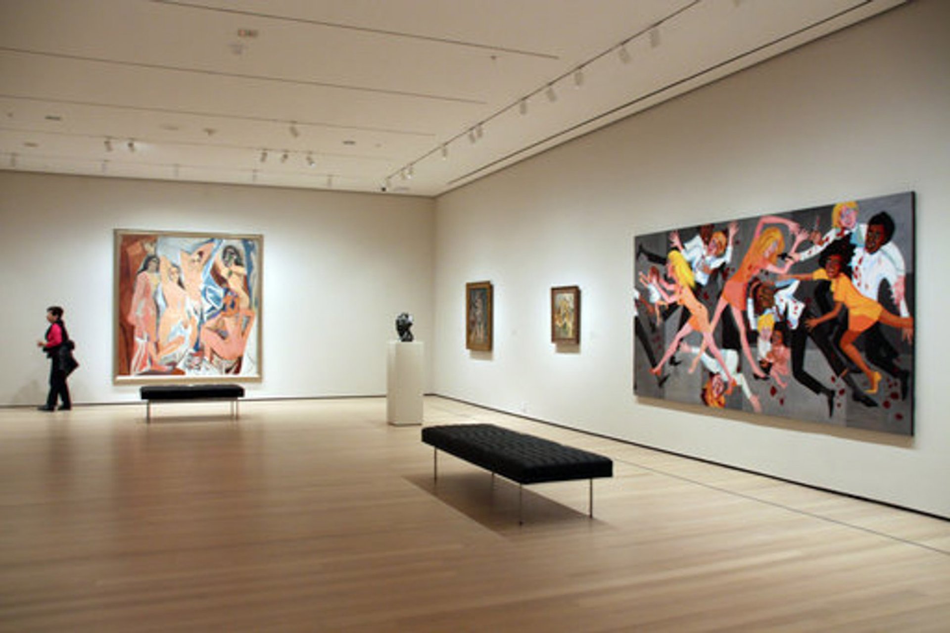
Interruptions like these resonate and accumulate throughout the rehang. Writing in the New York Times, Holland Cotter called the placement of Faith Ringgold’s American People Series #20: Die (1967), a gut-punch of a painting about racial violence, near Picasso’s landmark Les Demoiselles d’Avignon (1907) “a stroke of curatorial genius”; I agree. There are other equally exciting moments, like an Alma Thomas painting in a Matisse room; a corner that puts Carmen Herrera and Ellsworth Kelly in conversation; and the inclusion of an alphabet invented by the rapper and artist Rammellzee with well-known Conceptual works.

The paintings "Les Demoiselles d'Avignon" by Pablo Picasso (l) and "American People Series #20: Die" by Faith Ringgold hang in a room in the Museum of Modern Art DPA/PA Images
Complex ripples
At times entire galleries feel wonderfully generative, including one devoted to self-taught artists (evoking the ghost of the American Folk Art Museum, which was demolished to make way for this expansion); another that unites body-centric works by Senga Nengudi, Joan Semmel, Laurie Simmons, and Jimmy DeSana; and one devoted to Florine Stettheimer and her brand of aesthetic whimsy, something rarely celebrated at the cerebral MoMA.
All these breathe much-needed fresh air into a formerly white-, Euro- and male-centric narrative that was stuffy and stale. The commingling of different disciplines performs a similar feat. As Charlotte Higgins observed in the Guardian: “The view of art history on show here is no longer one of straight lines and linear progressions, but one much more like the complex ripples set in motion by pebbles thrown into a pond.” Overall, the story told by MoMA now feels less insular and abstract, more grounded and human.
And yet, once your eyes adjust to this new, welcome, vision, you may start to see more clearly what’s missing—because a lot still is. There isn’t a single work by a Native American artist on display, a glaring omission, especially in light of a soon-to-open survey of Native painting at the National Museum of the American Indian in New York. Social practice, digital art, and other work using new technologies are given short shrift, as MoMA drags itself into the 21st century. Even the expanded focus on what Cotter calls “Modernism Plus” looks limited when you consider how much richer it could be by incorporating the contributions of more African American abstractionists, India’s Progressive Artists’ Group, and Arab modernists like Huguette Caland and Parviz Tanavoli.
For now, the museum has filled some gaps with two terrific permanent collection shows dedicated, respectively, to textile art and Latin American abstraction. Both are on view until next spring, but will leave big holes in their wake if they’re not somehow incorporated into the main galleries after that. They might be—MoMA plans to refresh its rehang every six months—but we’ll have to wait and see.
Such a guarded approach is generally the critical consensus regarding the revamped institution. “My guess is that in some hopefully ever-improving version, this 21st-century MoMA will work, if only for self-preservative reasons,” Cotter wrote in the New York Times. In ARTnews, Andrew Russeth admitted to “lukewarm” praise before “imagining alternatives for the $450 million that created it”. Paddy Johnson, for the New York Observer, acknowledged the “better viewing experience” while also calling it a “spectacle” and an “outcome of our new plutocracy”. These assessments strike me as spot on, a necessary weighing of the improvements of the expansion against the conditions that made them possible. We’ve been given a Museum of Modern Art that’s unquestionably bigger and better, but it’s worth asking: at what price?
Museum of Modern Art, New York
Reopened: 21 October 2019
Curators: Ann Temkin, chief curator of painting and sculpture, and MoMA team
Tickets: $25, Seniors (65 and over) $18, Visitors with disabilities $18, Students $14


