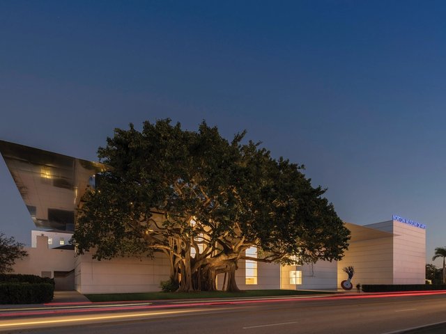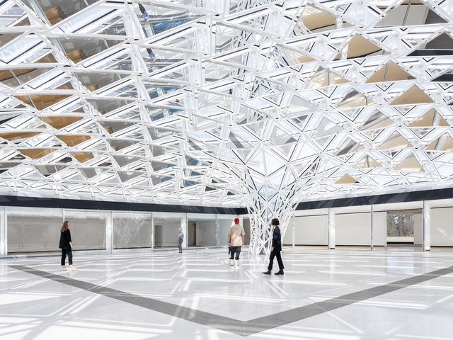
The new façade of the Norton Museum of Art , as seen from South Dixie Highway, designed by Foster + Partners Image courtesy of Foster + Partners
When you think about museum expansions, the big ones probably come to mind: expensive, starchitect makeovers that enlarge an institution’s gallery space while also driving up its budget. But three projects underway or recently completed in South Florida serve as reminders that museum renovations can take different sizes and forms, all in service of similar goals.
The most high-profile of these is the Norton Museum of Art’s $100m project. Designed by the Pritzker Prize-winning architect Norman Foster and his firm, Foster + Partners, the expansion is the most comprehensive in the institution’s history. The centrepiece is a new 59,000-sq-ft wing that will increase the museum’s exhibition space by 35%. Among other things, this will allow the Norton (which is currently closed) to dedicate space to its photography collection for the first time.
“We feel like the building is a fantastic vessel for our aspirations, for our collections and programmes,” says the Norton’s outgoing director, Hope Alswang, who has overseen the renovation during her eight years at the helm of the institution. Alswang predicts that the new space will also encourage donors to make gifts to the Norton. “When people see this building, they will feel that the museum is worthy of their collection,” she says. In fact, that has already happened, even though the project is not complete: inspired by the expansion plan, the collectors Howard and Judie Ganek donated more than 100 works of contemporary art to the museum in April.
You could stand in front of the museum and people would ask: ‘Where is the museum?’Irvin Lippman, director of the Boca Raton Museum of Art
But the initiative is not only about collectors; it is about making the Norton “a great public institution” that is “available to the broadest possible public”, Alswang says. As part of this effort, Foster is creating a 43ft-tall great hall that the Norton calls a “living room” where people can gather, as well as adding two new buildings, an education centre and auditorium to the campus.
Perhaps the most sweeping change, however, is the physical reorientation of the entire museum. The architect Marion Sims Wyeth originally designed the Norton in 1941 as a series of Art Deco pavilions arranged on an east-west axis. In the decades that followed, the symmetry was broken with the addition of a parking lot and other elements, and the entrance was moved. When the museum reopens on 9 February, it will once again adhere to Wyeth’s plan and face US Route 1—surrounded this time by a sweeping new sculpture park, Foster’s first. The architect calls it a “museum in a garden”.
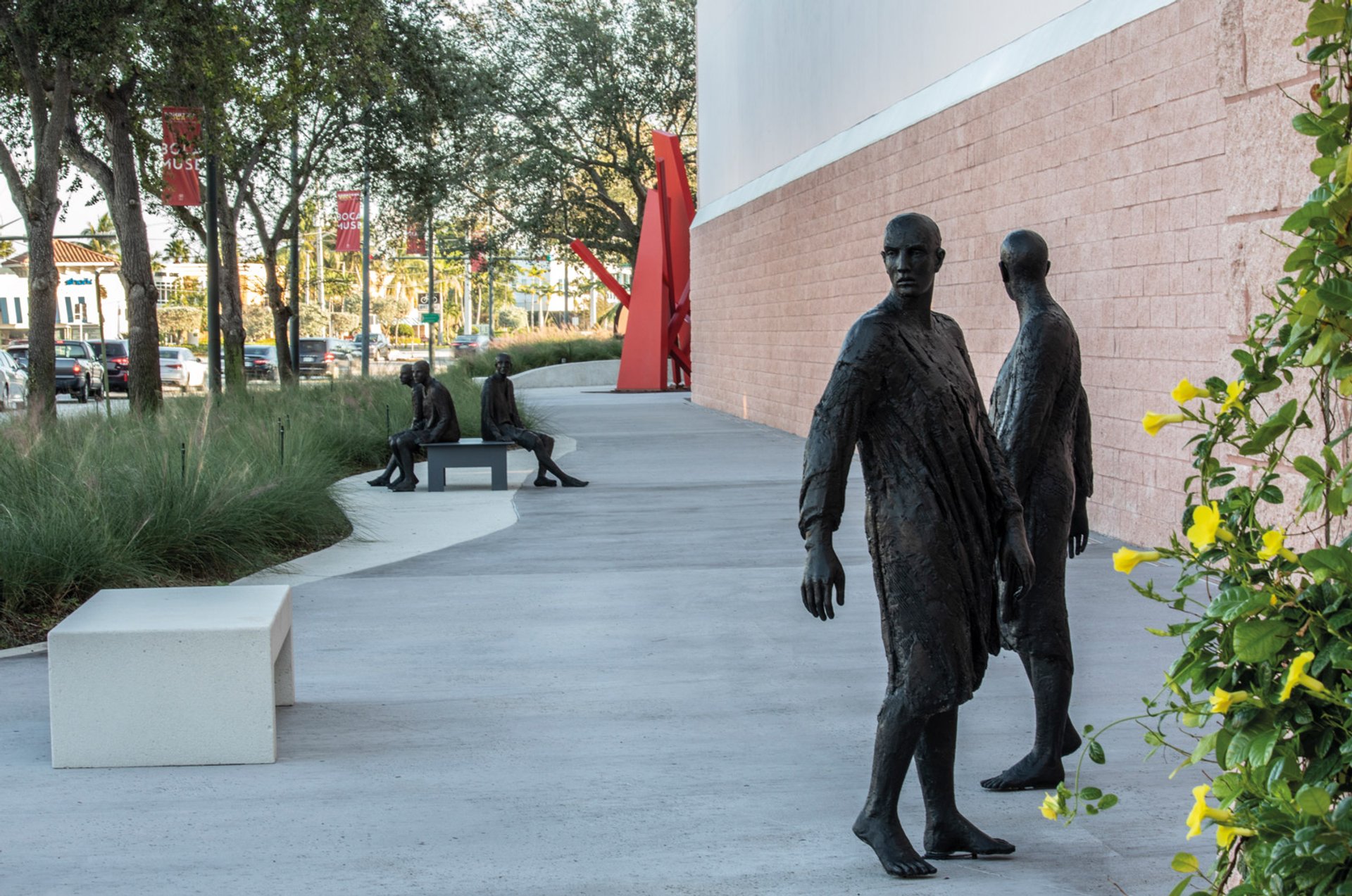
Boca Raton Museum of Art's new promenade with sculptures from the collection © Robin Hill
Increasing visibility
About 25 miles to the south, the Boca Raton Museum of Art has undertaken a renovation that is smaller in scale and budget but aims to have an analogous effect. Its pale pink home was designed by Donald Singer and erected in 2001, also along Route 1, in the city’s Mizner Park area. Shortly thereafter, an amphitheatre was built just to the east, sandwiching the museum between that structure and the highway. The building thus quickly became “somewhat anonymous”, as its director, Irvin Lippman explains. “You could stand in front of the museum and people would ask: ‘Where is the museum?’”
The purpose of the recent $1.8m renovation, which is just about complete, has been to make the Boca Raton Museum both visible and inviting. This is being done solely through outdoor alterations, with no new wings or gallery spaces added. “You drive by at 35 or 40 miles an hour on US 1,” Lippman says. “How do you get people to slow down?”
The museum hired the architect Margi Nothard’s Glavovic Studio—with whom Lippman previously worked on a renovation at the Nova Southeastern University Art Museum in Fort Lauderdale—and the landscape architect Roberto Rovira for the job. Together they collaborated on a 27,000-sq-ft park-like promenade along the underused highway-facing side of the museum. With sculptures from the collection also installed there, the area becomes an extension of the pre-existing sculpture garden.
Nothard and Rovira also re-envisioned the south side of the museum, which has been dominated by a loading dock gate. Rather than replace one conventional metal structure with another, Nothard created something new: a gated fence made up of vertical aluminium panels of different widths and shades that are arranged at varying intervals. It leads into a green wall designed by Rovira.
“During the course of the design, we decided that it really was an architectural element that became a work of art,” Lippman explains. Accordingly, the museum gave it a title, Mending Wall, after the poem by Robert Frost. Lippman sees a resonance between the poem’s famous dictum—“Good fences make good neighbours”—and Nothard’s creation.
“Can you use a fence or a gate to connect neighbours, as opposed to separate them?” he asked. “The gate becomes sort of an extension of the museum and how we would like to engage visitors from the moment they’re outside until they come inside.”
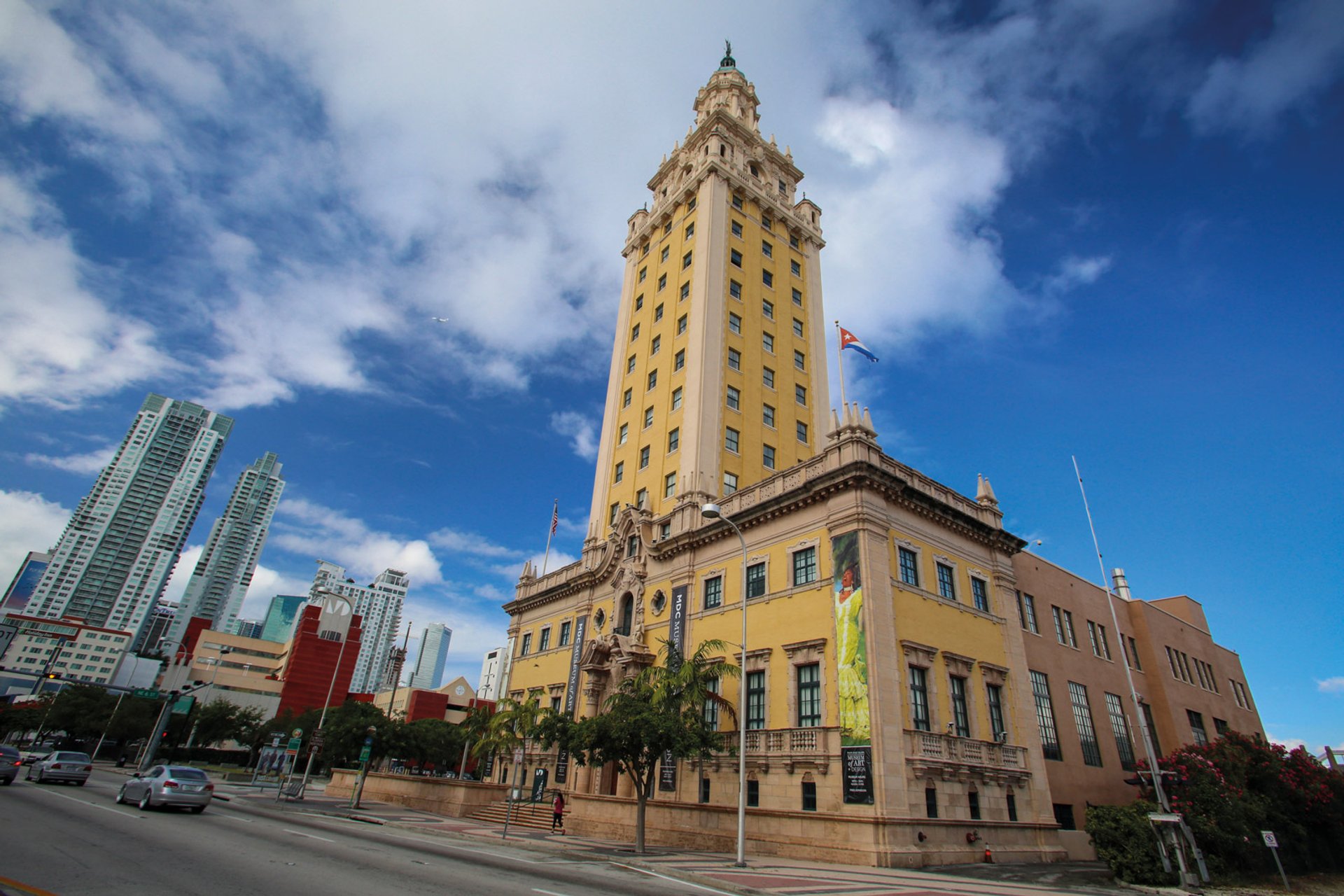
Miami's Freedom Tower, home to MOAD, reopened in April © Cristian Lazzari/MDC
A lack of public space
For Rina Carvajal, the reactivation of the Museum of Art and Design at Miami Dade College (MOAD) is not only about drawing people into the institution but also about the opposite: “The idea is to take the museum out of the building and to put the museum into the city,” she said. That initiative, called Museum Without Boundaries, is one element in a reimagining of MOAD’s identity and purpose undertaken by Carvajal, the institution’s director and chief curator. And it was partly born of necessity.
The museum is located in the Freedom Tower, a landmarked 1925 building that originally housed the Miami News. A local family bought and restored the structure in the late 1990s and in 2005 donated it to Miami Dade College. However, upgrades were slow to materialise, which meant that MOAD lacked the technical capacities of most art museums.
The idea is to take the museum out of the building and to put the museum into the cityRina Carvajal, the director and chief curator of the Museum of Art and Design at Miami Dade College
In 2017, the institution embarked on a $245,000 renovation that kept it closed for a year while the facilities were modernised. The museum reopened in April and, as an example of what has changed, Carvajal pointed to one of the new exhibits: William Kentridge’s More Sweetly Play the Dance, a video installation piece that requires eight projectors. Before, “I couldn’t even plug in two,” she says. “Now, technically, we can do anything we want.”
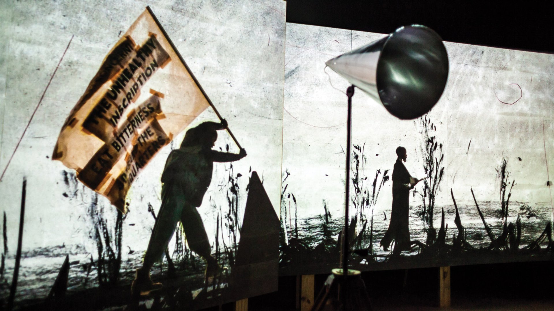
William Kentridge's video installation piece More Sweetly Play the Dance Photo: Francisco Moraga
In many ways though, the museum’s new direction has been shaped more by the limitations of Miami than those of the Freedom Tower. Caravajal laments the dearth of public space in the city, calling it “a bit inhuman sometimes. We lack this opportunity to have a more collective life, and I think that is something I can provide,” she says. “We can produce some alternatives by humanising the city where we live.”
The Museum Without Boundaries initiative attempts to do that through rigorous public programming. For the first season, MOAD partnered with various cultural organisations and institutions throughout the city to produce a series of performances, talks, screenings, workshops and more, all under the umbrella theme Living Together. The second season, which will begin in January, will have a similar format and a new theme, A City of the People. Carvajal says the initiative was a success and credits Miami Dade College (whose mission aligns with her vision for a museum “that is not so elitist”) as well as her organisational partners for a willingness to experiment.
“These are people that also want the kind of Miami that I think we should have. And so we are collaborating,” she says. “I call it the ripple effect. We throw one stone, and it will create this larger effect. Because in a way, we are just starting the conversation about something that we all need to talk about.”


