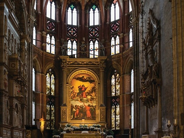
Rome has Michelangelo’s Sistine Chapel and Venice has the Scuola Grande di San Rocco, an imposing 16th-century structure in the city’s San Polo district decorated with a series of more than 50 religious paintings by Jacopo Tintoretto.
Executed between 1564 and 1587 and concentrated on two high-ceilinged floors, the series adorns the walls, ceilings and stairwell of the ornate Scuola, a confraternity of Christian laymen named in honour of a medieval French saint. The endeavour went on to take up much of Tintoretto’s working life, but it is one of his earliest paintings for the series that is the most celebrated—The Crucifixion, from 1565. The 11-metre long panorama, with more than 80 figures, is regarded as the Venetian painter’s masterpiece, and a singular achievement of the Italian Cinquecento.
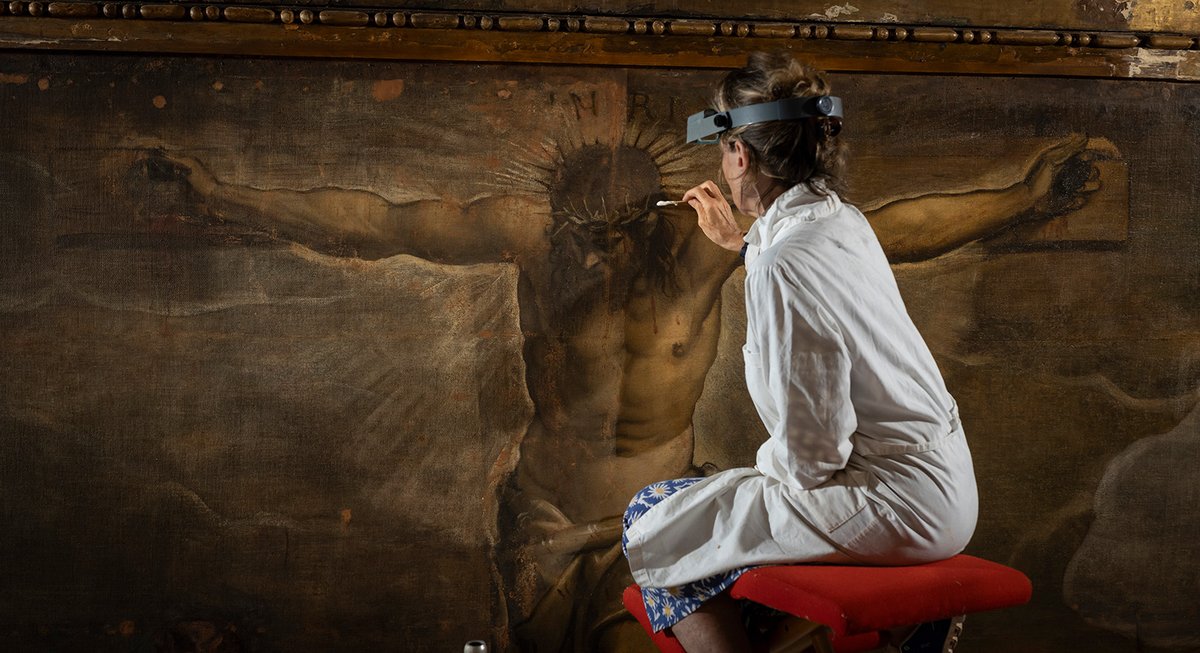
Under normal circumstances, The Crucifixion utterly dominates the building’s small upper-level boardroom, called the Sala dell’Albergo, but for the past two years the immense work has disappeared behind scaffolding as a team of conservators undertook an on-site treatment that removed distorting varnish while uncovering the artist’s working methods in technical analysis. The €650,000 treatment was organised by Save Venice, an American non-profit organisation dedicated to preserving the city’s cultural heritage.
Many changes to the painting are visible to the naked eye, says the conservator Caterina Barnaba, who is on the board of directors of Rome’s Conservazione Beni Culturali (CBC) and worked on The Crucifixion.
“The painting was obscured by an oxidised, very yellowed varnish,” says Barnaba, who has helped restore works by other important Venetian School artists including Paolo Veronese and Vittore Carpaccio. The varnish layers date to a previous treatment in the early 1970s to repair damage to the work in the wake of Venice’s catastrophic 1966 flood.
The new treatment not only removed them, but also altered faulty retouching of previous treatments. The painting now once again has “a great depth of perspective”, Barnaba says, and a corrected colour balance. For example, the work’s trompe l’oeil parchment inscription, in the lower-left corner, has gone from yellowish-brown to vivid white.
Confounding expectations
The project’s most sensational discovery may prove to be that Tintoretto apparently used a vast network of draughting grids to guide the transfer of figures from preparatory drawings and generally organise spatial relationships between figures. These grids were executed in charcoal, says Barnaba, who adds that the team now believes that a master grid was actually created over the entire surface of the painting. In addition, there are grids within the larger grid, used for accurately rendering more minor figures. It was previously known that Tintoretto occasionally used these draughting grids, here and in a few other select paintings, but not to such a wide extent.
During the Renaissance, draughtsmanship—denoted by the term disegno—played a paramount role in Florentine painting. Artists there typically created reams of preparatory drawings, followed by compositional drawings and a final completed sketch, or cartoon, with grid systems then used to transfer these manifold preparations to a final surface. Venetians, by contrast, were thought to be much less systematic and more improvisatory, relying on colour, rather than design principles, to bring a painting to fruition. A dearth of surviving drawings by many Venetian artists has helped to support this theory. There are precious few undisputed drawings by Giorgione, who helped usher in Venice’s poetic approach to painting in the early 16th century, and fewer than 50 by his younger rival, Titian.
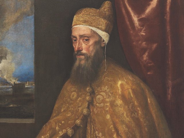
Handed down to centuries of critics and art historians, this 16th-century distinction between Roman and Florentine disegno—most famously associated with Michelangelo, whose surviving drawings number around 600—and the colorito of Titian has increasingly been revisited in recent decades, says John Marciari, the head of the department of drawings and prints at New York’s Morgan Library and Museum. New evidence of a complete grid covering The Crucifixion may lead to an expansion of this idea. Marciari, who curated the Morgan’s 2018 show Drawing in Tintoretto’s Venice, believes the disegno versus colorito opposition is no longer meaningful, since it is now believed that Venetian painters routinely did use drawings, if generally in a less rigorous way than the Tuscans. He believes, for instance, that Titian would have made any number of drawings, “but we just don’t have them”.
“When you needed a drawing, you made a drawing,” Marciari says of the 16th-century Venetians. “If you needed to scale a figure up using a grid system you did, but you didn’t do it every time.”
Known for his rapid working habits, loose contours and loose brushwork, Tintoretto did indeed use colour in a compositional manner, says Frederick Ilchman, who is Chair, Art of Europe, at the Museum of Fine Arts, Boston, and chair of Save Venice.
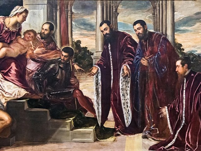
Ilchman, who has curated a number of shows about the artist, cites the example of an alternating use of colour in the clothing of the two figures hoisting up the penitent thief to the left of Christ: one has a pink turban and blue tunic and the other has a pink tunic and blue sash. A technique like this “helps to unify the giant painting”, he says. But underneath that bravura use of colour, we can now assume, was an organising framework.
“The confirmation of grids is a big deal,” Ilchman says. This fundamental use of draughtsmanship techniques demonstrates that “Tintoretto was quite methodical, despite his speed, and despite his improvising nature”.
Though a handful of surviving Tintoretto drawings have been linked to The Crucifixion, many more would likely have been made to justify the existence of a complete master grid.
Save Venice’s Melissa Conn, the director of the organisation’s Venice office, says The Crucifixion will go back on view to the general public later this spring. The CBC’s full findings will be presented at a conference in May, she says.
The restored depth of perspective accomplished by the treatment will also remind viewers of Tintoretto’s innovative use of an unusual, elongated format. Created to be hung just above eye level in a relatively compact space, it had greater impact than a more remote altarpiece. The intention, Ilchman says, was to “encompass our field of vision”.
Completed when the artist was in his mid 40s and already in the front ranks of Venetian artists, the painting “astonished everyone right from the start”, Marciari says.