Less is more. While the phrase was coined in the 20th century by the Modernist architect Mies van der Rohe, it could easily have been pronounced by Johannes Vermeer back in the 17th century. Not only did the Dutch artist focus primarily on one simple corner of a room, he also probably painted only 45 to 50 works over his lifetime. (He died aged 43, leaving his widow with 11 children and a huge debt.) We know of 37 paintings and, although not all experts are in agreement, 28 of them are on display in this magnificent Vermeer exhibition at the Rijksmuseum in Amsterdam.
Exhibition organisers will be learning from this show for years to come
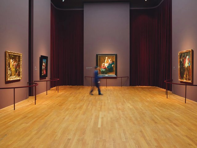
Though it was a logistical miracle to corral three-quarters of Vermeer’s output into one show, 28 is still very few paintings to hang in a large exhibition space. Luckily for us, the curators Gregor J.M. Weber and Pieter Roelofs have kept their nerve and trusted in ‘less is more’. Instead of cutting back the number of galleries or cluttering the available space with other contemporaries’ works or information about the world beyond Vermeer’s studio, they have hung each painting with a generous amount of room around it, making a virtue out of what could have been a problem. Several paintings have their own walls; some even have their own galleries. The effect of so much space is to slow visitors down so that we give each painting more time. With less to look at, we contemplate what is there with more attention, and start to see more.
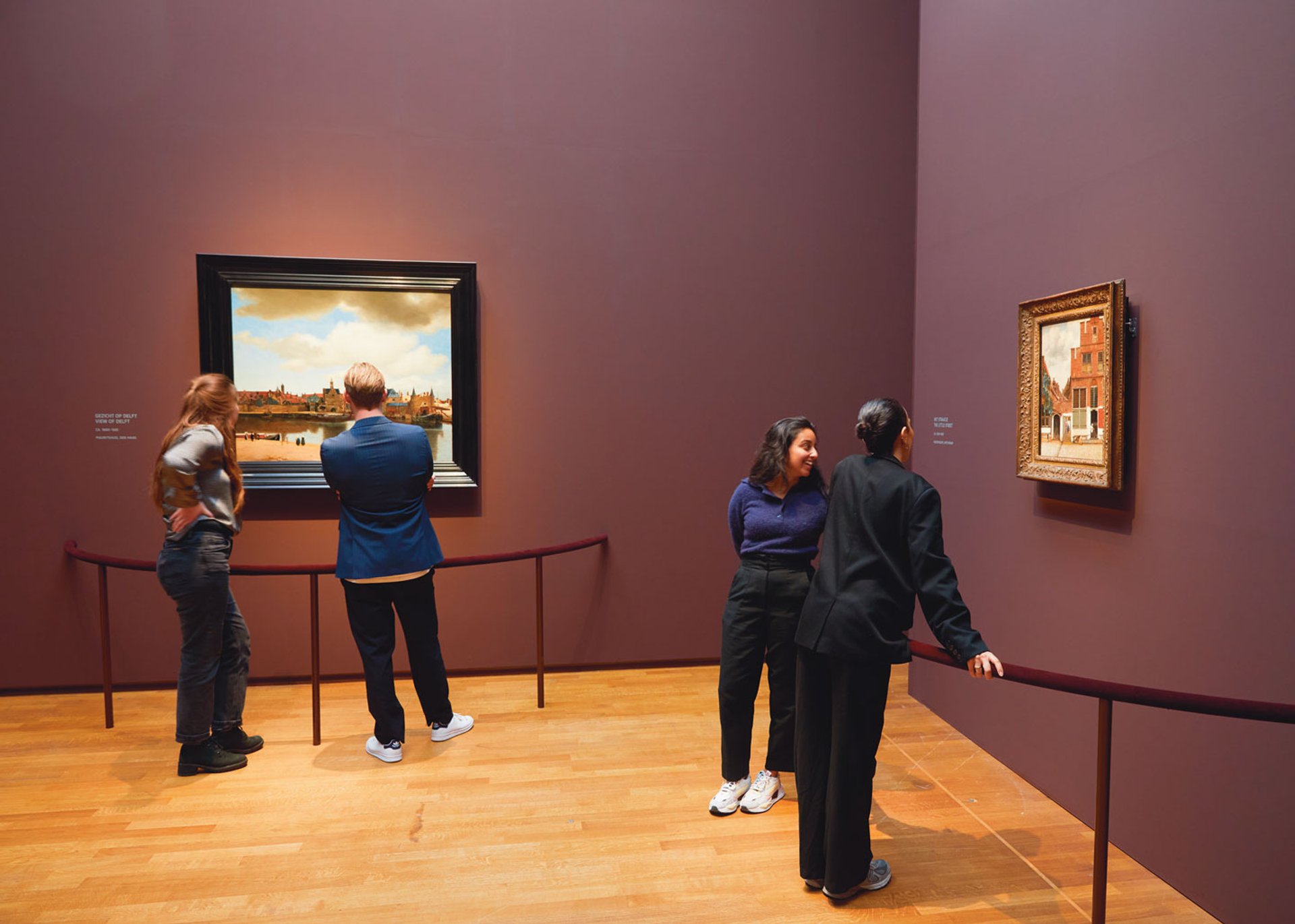
Visitors to the exhibition can lean on velvet covered barriers to take a closer look at masterpieces such as View of Delft (1660-61), left, and The Little Street (1658-59)
Hats off, too, to the designer Jean-Michel Wilmotte, who has had the rooms painted in sober (but not sombre) dark reds, blues and greens, and dressed them with matching ceiling-to-floor curtains that warm and soften the spaces and give the exhibition a dignified theatricality. The paintings absolutely glow from the walls. Elegant semi-circular balustrades in the same colours have been placed around the viewing spaces, for the design is tasked with the challenge of crowd control of such a popular show, as well as with presenting the Vermeers in the best possible light.
The curators have also chosen a ‘less is more’ approach to the interpretation of Vermeer and his work. And what a relief that is. Most rooms have a carefully written paragraph or two about Vermeer’s life and technique. Gone are the small labels by each painting that often distract, irritate and patronise. Here, simply the title, date and lender of the painting are stencilled on the wall, easily read from afar. We glance without having to perform that awkward dance between work and label that so often breaks up the rhythm of looking. The curators have trusted the Vermeers to speak for themselves, and us to formulate our own opinions. Curators everywhere, take note!
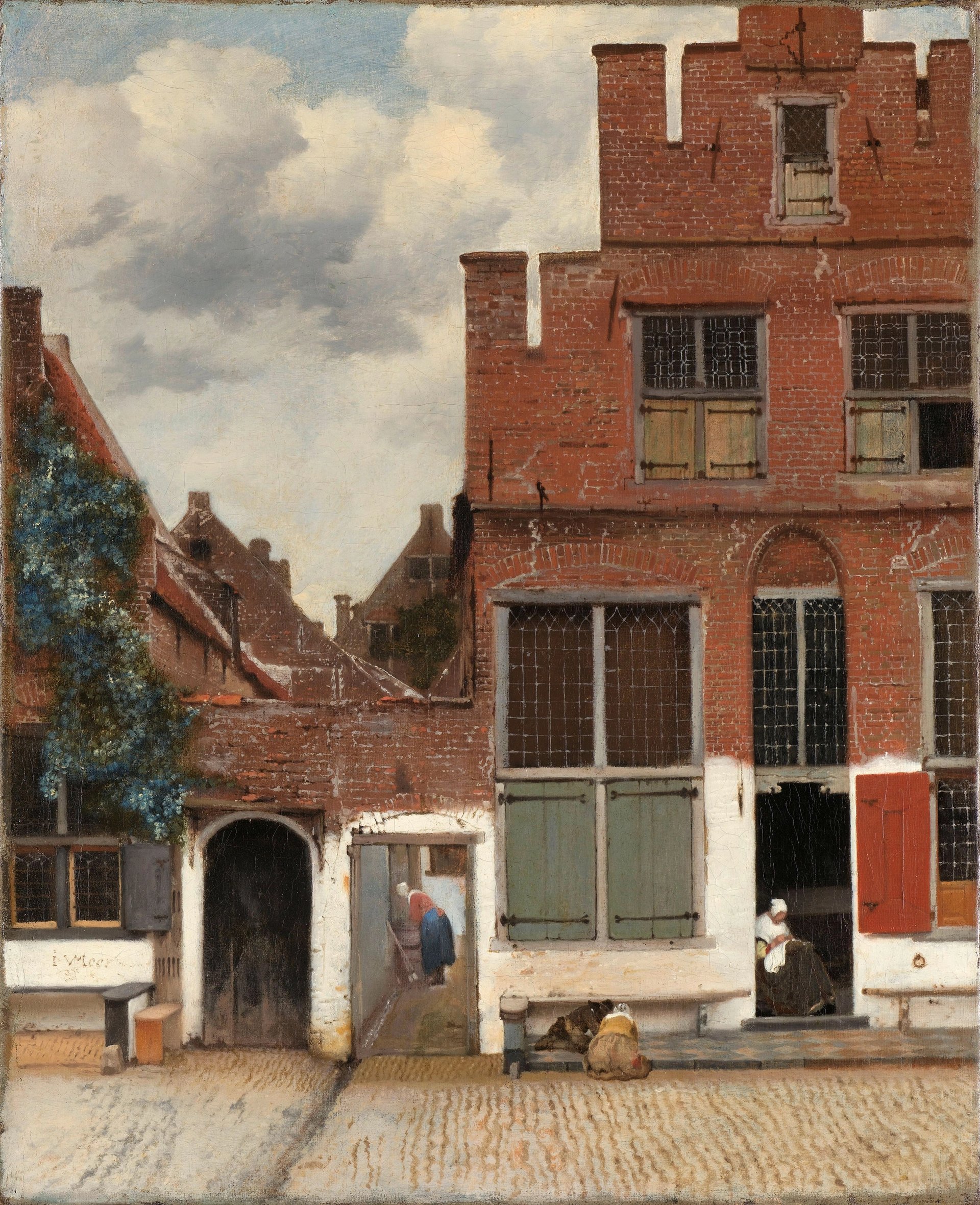
View of Houses in Delft, known as ‘The Little Street’ (1658-59)
Courtesy of the Rijksmuseum
What the curators and the designer have managed to do is exceedingly rare: they have told the story of Vermeer using his own aesthetic. Marrying what you say with how you say it results in an experience richer than the sum of its parts; this is what every creator—be it painter, writer or curator—is aiming for, and few achieve. I have never seen a show that has managed this so successfully. The exhibition itself has become a work of art. Exhibition organisers will be learning from this show for years to come.
The exhibition begins with context setting in the form of Vermeer’s only landscapes. First, his magisterial View of Delft (1660-61) reminding us of where he is from, and just how masterful a painter he is, and then, to one side, The Little Street (1658-59), a typical Delft house, with women sewing and sweeping and children playing in the street. This leads us nicely into the domestic realm, where for the most part we will remain.
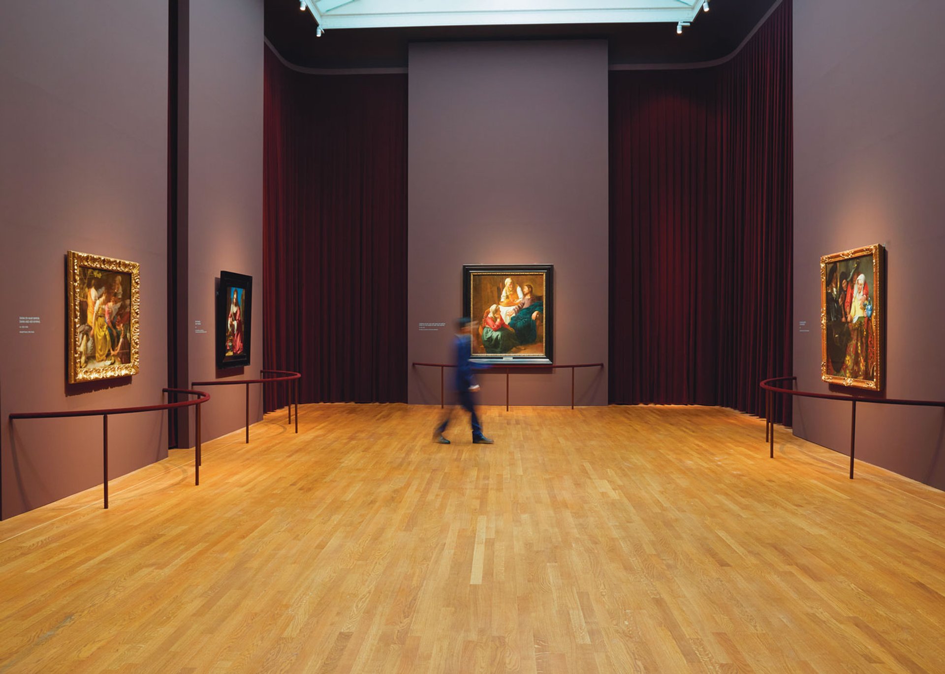
Installation view of Vermeer exhibition showing the use of velvet curtains to soften the space Photo: Rijksmuseum / Henk Wildschut
While the layout is not strictly chronological, in the second room Vermeer’s early works serve as a reminder of how far he develops from standard genre paintings or those with religious or mythological themes. He is learning how to use colour, how to handle light, how to paint folds in cloth. These are journeyman works, competent but no more. I personally would not know they were by Vermeer—and I can normally spot a Vermeer at a hundred paces.
Highlights gleam and shine like silent, spangled stars
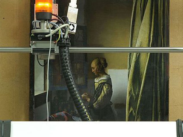
But then we arrive at Girl Reading a Letter at an Open Window (1657-58) and The Milkmaid (1658-59), and the Vermeer we recognise has arrived. Both women stand isolated in a corner of a room, the light flooding in from the window on the left. Something has shifted in his aesthetic eye; Vermeer has found his mojo—and his ideal size, for these and most subsequent paintings are smaller, and successfully so. The colours are condensed, the light picks out details. The girl’s letter gleams white; the bread on the milkmaid’s table is flecked with gold droplets. Did Vermeer begin using a camera obscura to look at these scenes and imbue them with colour, light and a sense of distance from the viewer? Perhaps. However he arrived at his signature strengths, we can see it clearly throughout the exhibition, where this sense of intimacy, mystery and reverence for the ordinary is miraculously sustained.
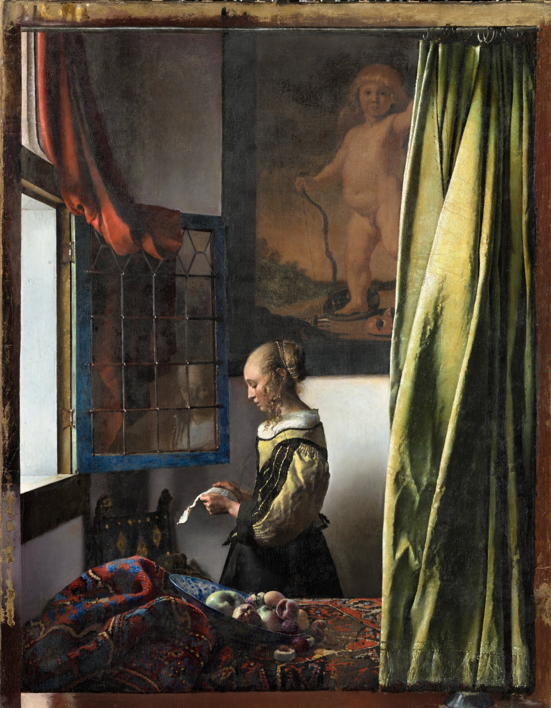
Girl Reading a Letter at an Open Window (1657-58)
Courtesy of the Rijksmuseum
Vermeer’s mid-period paintings are cleverly grouped in elastic themes, of women writing and reading letters, of musical interludes, of women with male visitors, of women gazing out at us. One of the joys of so many Vermeers together is that we can easily make comparisons, and consider the paintings as among other family members, with their resemblances and differences. We can trace through the paintings certain women, certain clothes, certain chairs and carpets, certain moods. We can compare the light when a window is open or shut, or a wall that is empty with that same wall with a painting hung on it. We can reassess our favourite Vermeers compared to others.
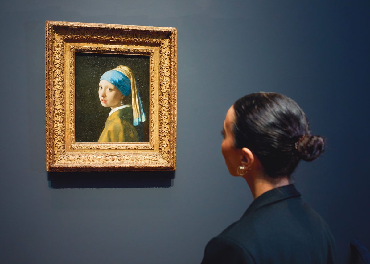
I admittedly have a complicated relationship with my own favourite, Girl with a Pearl Earring (1664-67). It is an image I have looked at, written about and spoken of repeatedly over the past 25 years. Inevitably it has become so familiar to me that I do not always ‘see’ it. At this exhibition, however, when I viewed it with other Vermeers nearby, it took its place among its sisters, its cousins, its neighbours. The painting was no longer elevated to ‘favourite’; rather, the other works grew to become equally powerful, and to work their secretive magic.
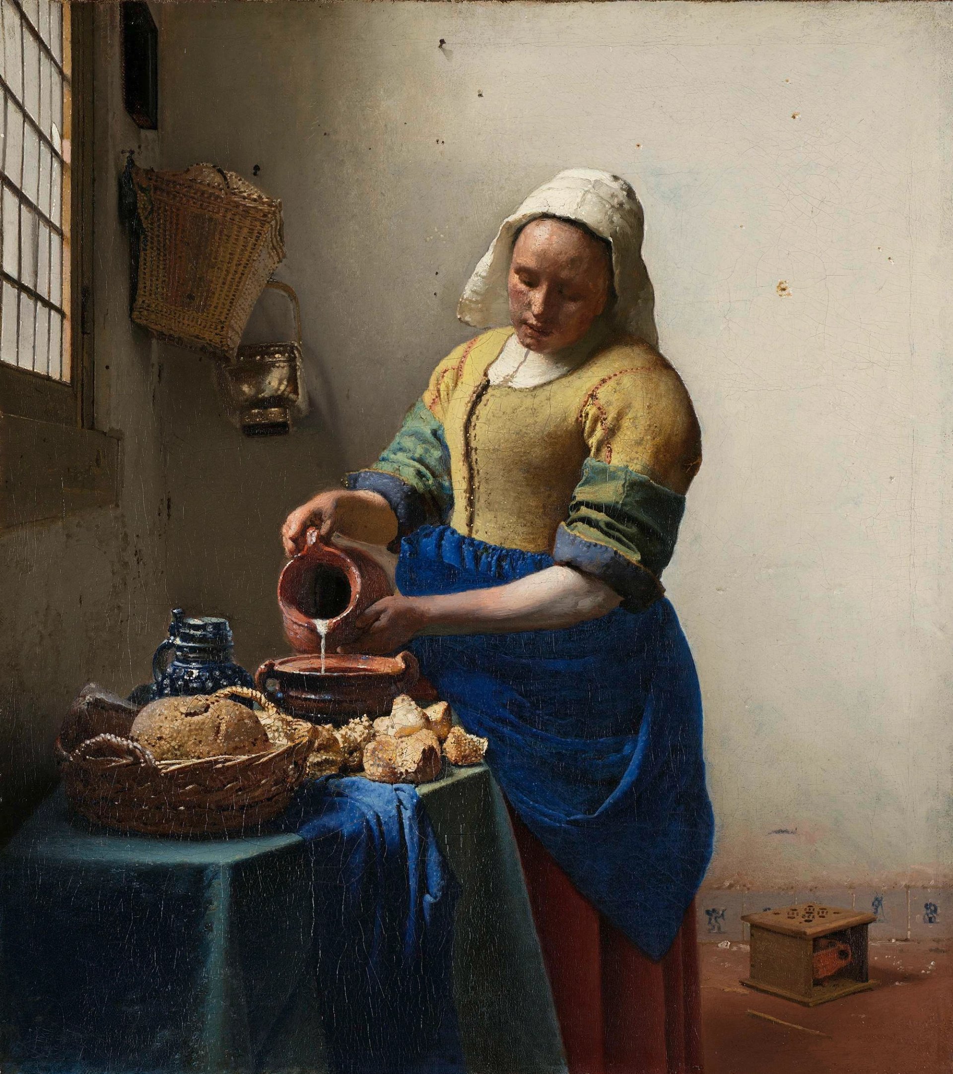
The Milkmaid (1658-59)
Courtesy of the Rijksmuseum
I thought I knew Vermeer’s paintings well, but I was startled to discover new details, such as how often he uses red, sometimes as an accent—ribbons in hair or as a tie on a yellow skirt; thread from a sewing box—or as an item of clothing. The Milkmaid is dominated in our minds’ eyes by blue and yellow, yet she wears a red skirt. And throughout the galleries, highlights gleam and shine like silent, spangled stars.
This is such an important exhibition—the Vermeer show of the century—that those collections too fastidious to lend their Vermeer will regret missing the party. I am particularly disappointed that The Art of Painting (1666-68) is not being lent to the exhibition by the Kunsthistorisches Museum in Vienna. In this particular masterpiece, we may actually get a glimpse of the artist himself—at any rate, of a painter with his back to us, absorbed in his model and his work (and wearing red hose). Indeed, an empty wall awaits the work should Vienna change its mind and allow its painter to make a belated appearance. It would be the perfect way to round off this exquisite show.
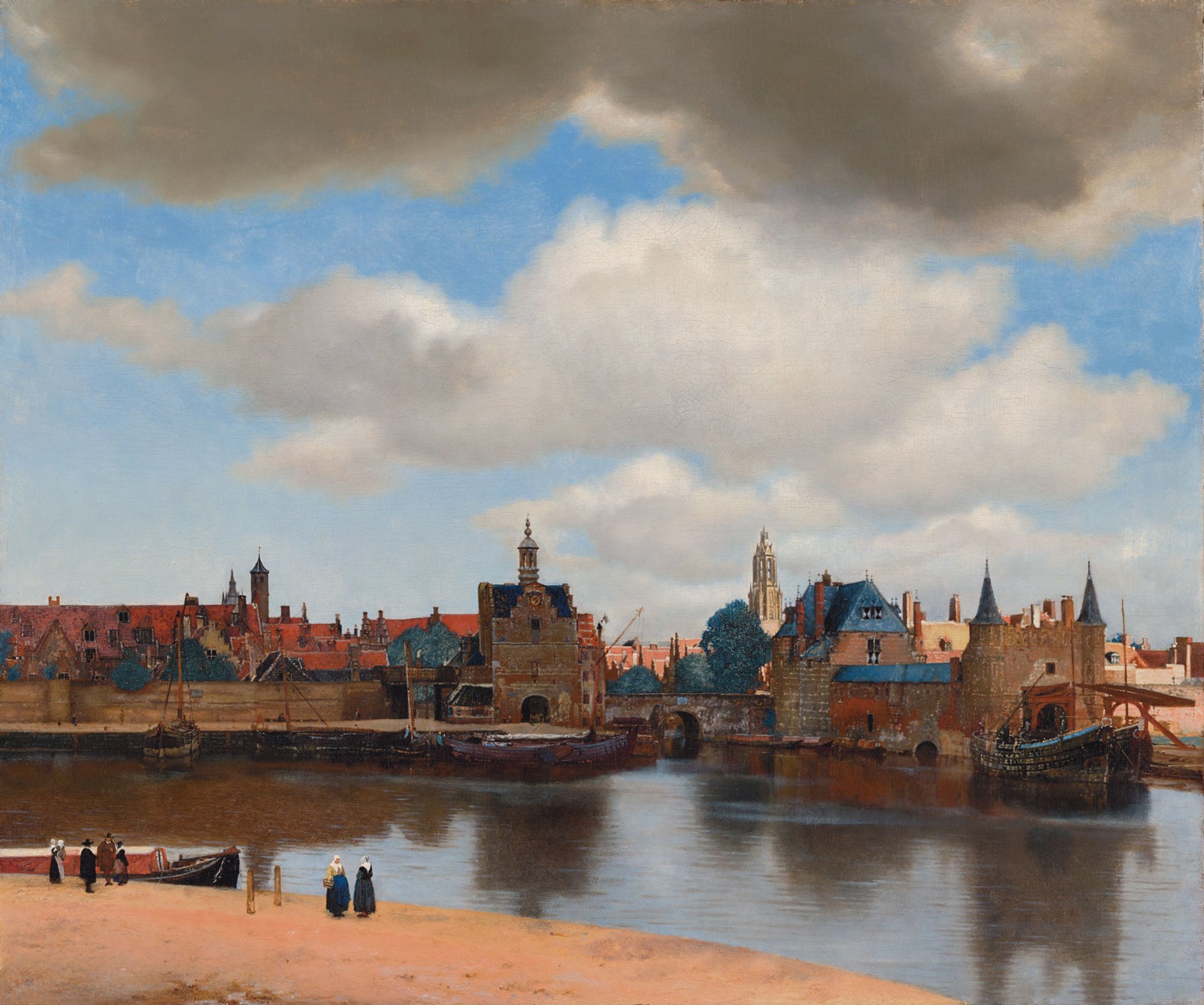
Vermeer's View of Delft (1660-61) Mauritshuis, The Hague
What the other critics said
No critic would dare to pan this exhibition and this painter. “Breathtaking,” “mesmerising,” “momentous,” “more precious than pearls”: reviewers have stretched for superlatives. Most struggle to pinpoint Vermeer’s enduring appeal.
Rachel Campbell-Johnson goes poetic in The Times: “These are paintings to ensnare the imagination. They distil a mood and settle slowly as a sediment down through the mind. Yet, even as they lure you in [...], the longer that you look the less you feel that you know. This is the mysterious magic of this Golden Age master.”
Philip Kennicott in the Washington Post wondered if overfamiliarity would undermine the show: “I went in thinking [...] it might be necessary to quibble with an exhibition that includes only Vermeer and none of his supremely gifted contemporaries. But I was wrong, and I was deeply moved.”
Meanwhile, Waldemar Januszczak summarised it in the Sunday Times: “Paradigm-shifting, brilliantly presented, cleverly designed, revelatory, intoxicating — this is one of the great art experiences of my lifetime. And yours.”
• Tracy Chevalier is a novelist and author of the international bestseller Girl with a Pearl Earring (1999)
• Read our top coverage of the Dutch Old Master and the latest news from the once-in-a-lifetime show now.
• Listen to our Vermeer podcast special as Ben Luke interviews curators, an artist and the Rijksmuseum director about the man, the show and the attribution debate.


