The Japanese architects Kazuyo Sejima and Ryue Nishizawa formed SANAA in the mid-1990s. They have designed houses, shops, offices and educational buildings, but have become best known around the world for their museum and art gallery buildings, which are admired for their light, unshowy forms which sit in an harmonious relationship with their environment. Many of their museum buildings, including the expansion of the Art Gallery of New South Wales, are made of up discrete blocks or pavilions which allow visitors to explore them in a free-flowing way. They won architecture’s most prestigious award, the Pritzker Prize in 2010, and this year won the Japanese arts prize, the Praemium Imperiale.
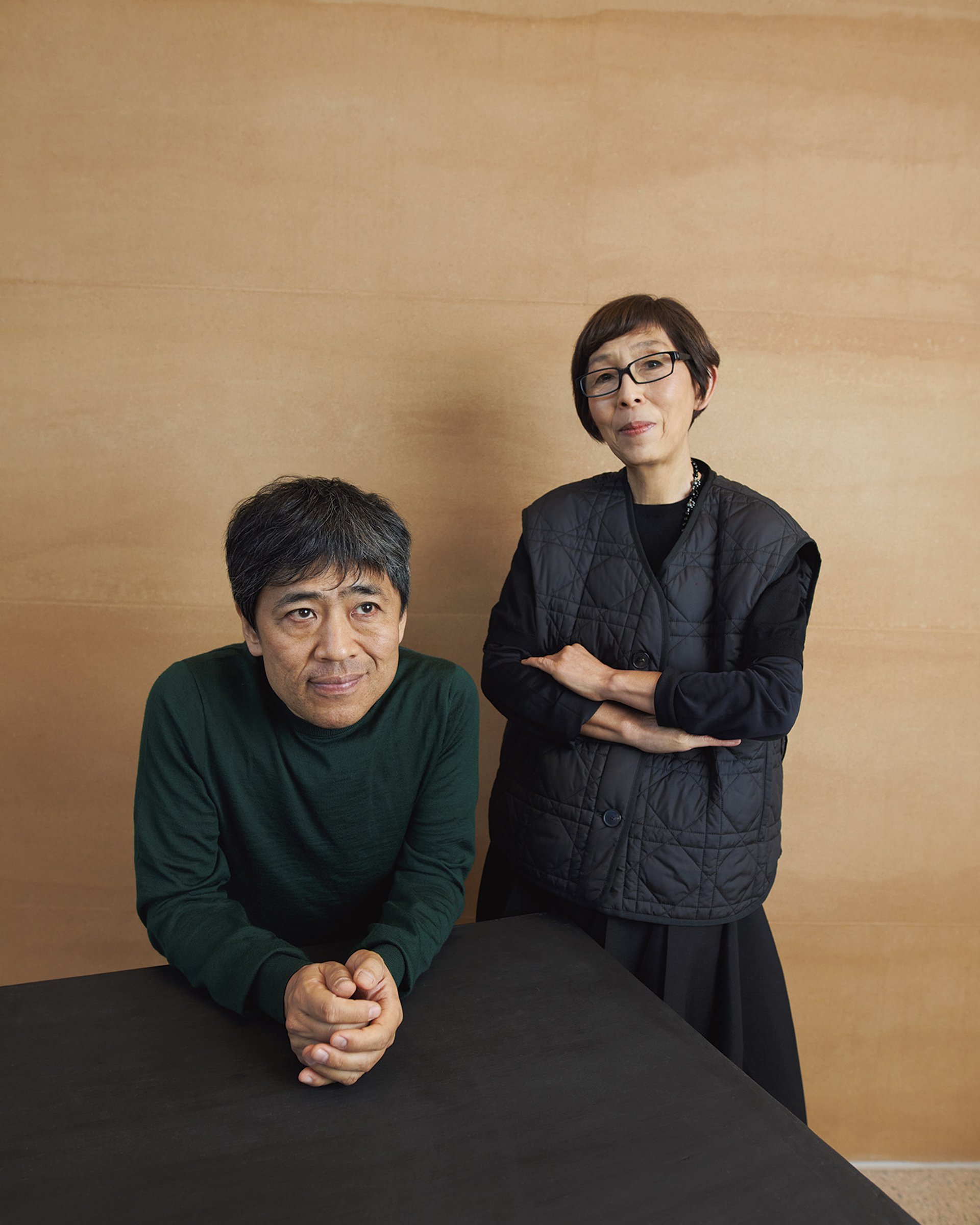
Ryue Nishizawa (left) and Kazuyo Sejima © AGNSW
The Art Newspaper: What makes this a particularly “Sydney” building?
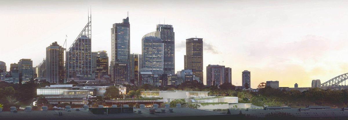
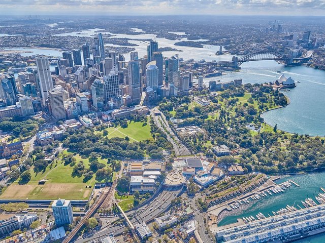
SANAA: Sydney is beautiful and the site for this project is in a particularly attractive place. The special feature is that one can enjoy Sydney’s natural landscape, the buildings and the art together. This is a building that breathes with the city, park and the beautiful harbour. The atmosphere changes as the sun rises and sets and one can see or sense these changes from within the building.
What conversations did you have with the Art Gallery of New South Wales before starting the project? Did you have an idea of what works would be exhibited in each space?
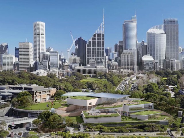
After winning the international competition, we worked closely with the art gallery to refine our initial design. The land has an important history, so preservation and harmony with the environment was a design priority. Throughout the process, we discussed the importance of creating different types of spaces for art display. Some of the formal spaces are located within the three limestone art pavilions. We also imagined art to be displayed in informal spaces and the exterior so that in any part of the building, the visitor can feel connected to the art.
The land has an important history, so harmony with the environment was a design priority
How does the new building connect to the original building? The architecture is a sharp contrast?
Connecting the original and new gallery buildings is a semi-shaded outdoor area open on all sides. It is a shared space for the community and a large open plaza into which many activities can spill simultaneously.
How sustainable is the new building?
Many strategies were used to reduce the energy consumption, like the use of buffer zones to insulate the more [climate-] controlled spaces. But something new for us is the rammed earth wall, made with local materials. It sweeps across two levels of the building inside and out, creating a strong connection with the environment.
What do you hope visitors’ experience will be as they explore the new building?
We aimed to design a building that is harmonious with its surroundings. We think it is important to make a place that everyone likes or hopes to be a part of—to inspire people to be open to new ideas and experiences.
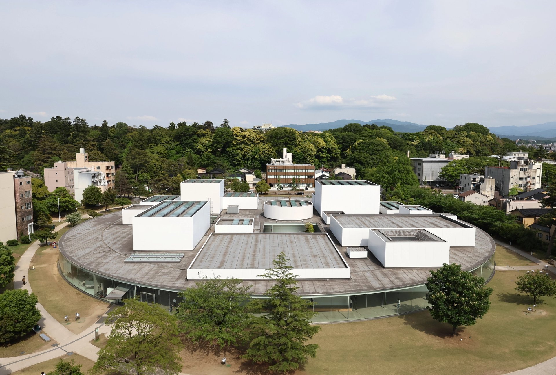
21st Century Museum of Contemporary Art, Kanazawa, Japan
©︎ The Japan Art Association / The Sankei Shimbun
Five other major museums designed by SANAA
21st Century Museum of Contemporary Art, Kanazawa, Japan (2004)
This is the building that put SANAA—and the remote Japanese city of Kanazawa—on the art world map. Instead of a building with large exhibition spaces that uses moveable walls to divide it up, SANAA’s design comprises 18 small spaces. Each space, whether for showing art, a library, bookshop or restaurant, takes the form of a discrete glass pavilion, linked together under a circular roof. Visitors are encouraged to wander freely, choosing their own path between the pavilions.
Glass Pavilion, Toledo Museum of Art, Toledo, US 2006
Toledo has a long history of glass manufacture, and the museum has one of the world’s most extensive collections of glassware—more than 5,000 objects from ancient to contemporary. Appropriately, SANAA’s single-storey pavilion is a labyrinth of curved glass walls, allowing light to penetrate to the heart of the building. As well as displays, the pavilion houses a functioning glassmaking workshop.
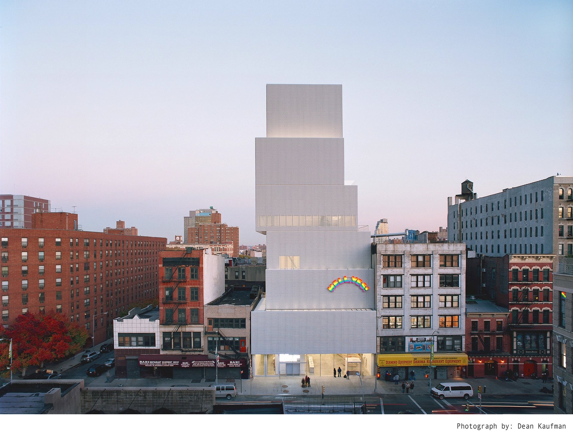
New Museum, New York © Dean Kaufman
New Museum, New York, US (2007)
SANAA created a new building for New York’s New Museum (above), which is dedicated to introducing new art and ideas. Here, SANAA’s characteristic square pavilions are placed on top of each other, like a teetering pile of board game boxes. In 2008 it was named one of seven new architectural “wonders of the world” by Condé Nast Traveler magazine.
Serpentine Gallery Pavilion, London, UK (2009)
Many of the world’s starriest architects have created summer pavilions as part of the Serpentine Galleries’ annual commission. SANAA’s contribution was a simple flat roof with undulating edges, held aloft on slender columns. Made of aluminium, it looked like a floating pool of water, reflecting the clouds and the trees.
Louvre-Lens, Lens, France (2012)
When the world’s most famous museum decided to create an outpost in the town of Lens in northern France, SANAA were the obvious choice, riding high on the success of the 21st Century Museum of Contemporary Art. Again the functions of the museum are separated into individual pavilions—here covered in aluminium and stretched out in a former mining area. The centrepiece is the 125-metre long Galerie du Temps, where 6,000 years of art are shown in a chronological sequence.
• Read all of our articles on the Sydney Modern Project here


