What makes a museum building successful? Until the arrival of Frank Gehry’s Guggenheim in Bilbao in 1997, this question might have been almost exclusively focused on the best environments in which to view art. But the Guggenheim’s phenomenal success, which allowed the Basque government to recoup the construction costs within three years, moved the debate on to issues of branding and statement architecture.
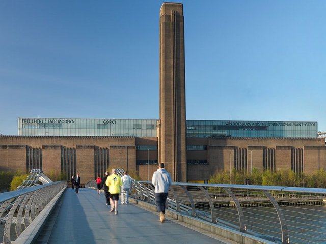
Now the discussion has moved on again. In the public imagination, museums have been transformed from cultural destinations into leisure ones, and there has been a global rise in visitor numbers. Tate Modern’s new extension, designed by Herzog & de Meuron, was partly predicated on annual visitor numbers topping five million instead of the two million originally envisaged when the institution opened in 2000. The new wing is notable for the spaciousness and drama of its circulation spaces as much as for the galleries themselves. The other challenge for museum architects today is to design spaces for forms of media, such as video and performance, that are an increasingly prominent part of institutional programming.
As museums get bigger, the tension between intimacy and expansiveness becomes more difficult to resolve. As the artist Thomas Demand notes, some architects, such as Norman Foster, are skilled at moving large numbers of people around airports, while others, such as David Chipperfield and Caruso St John, are experts at intimacy. “The two together is the task—scale and intimacy,” Demand says.
We asked architects, artists and curators to name their favourite museum buildings

Thomas Demand
Artist
Architects often build museums for their taste, rather than for the collection that will be housed there—that’s the first problem. Philip Johnson hated certain artists and when he designed museums, he prevented them from being shown. You will never see a Carl Andre in one of his museums; he’d put down a tropical wood floor or something. But whatever you do, the artist will challenge the context to make their show unforgettable. The best museums are the ones you can take a walk through. You mustn’t see everything at once; every space should not be the same and, because artists create their own worlds, you need windows to connect you to the outside world. At Hans Hollein’s Abteiberg Museum in Mönchengladbach, Germany, every space is accessible through a corner, allowing installations that are not dominated by the architecture. David Chipperfield’s Neues Museum in Berlin is great, with every detail, down to the door handles, considered. Caruso St John Architects give spaces atmosphere, intimacy and uniqueness—their most daring being Tate Britain, where they got the strength of the decoration right. It’s a question of proportion and sensibility.

Cornelia Parker
Artist
All artists want is a neutral, beautifully lit space in which to exhibit—a space that is uplifting and atmospheric before you even begin to absorb the art. I love the Guggenheim in New York, which is so great for retrospectives and chronological hangs. I admire Renzo Piano’s Menil Collection in Houston for its light, intimate spaces; the Kimbell Art Museum in Fort Worth, Texas, and the Yale Center for British Art in New Haven, Connecticut, both by Louis Kahn; the Met Breuer in New York, by Marcel Breuer; and Norman Foster’s Great Court at the British Museum. Artists don’t need flamboyant vanity architecture to fight with. Sadly, at Zaha Hadid’s MaXXI in Rome, the interior spaces are totally dominated by her ego; the artists’ work always looks compromised as a result. The Staatsgalerie in Stuttgart by James Stirling is tatty postmodernism at its worst.

Connie Butler
Chief curator, Hammer Museum, Los Angeles
I love architecture and don’t think that art should be placed in a generic white cube. As a curator, it can sometimes be interesting to push against architecture. I was just at the Serralves Foundation [in Porto, Portugal; designed by Álvaro Siza Vieira], where the galleries are glorious but not necessarily easy, with their strange angles. It works because the very choreographed space recedes to a backdrop for art when it needs to. A flexible architecture is ideal for a temporary space, and one of the best that started the trend for raw spaces is Frank Gehry’s 1983 Geffen Contemporary at the Museum of Contemporary Art, Los Angeles. The spaces I love include the Beyeler Foundation in Basel and the Menil Collection in Houston [both designed by Renzo Piano]. The light is beautiful and ethereal. It is also something to do with [the intimacy of] scale. Some galleries are so big that exhaustion sets in on the part of the viewer because there is no break, no punctuation. There is a curatorial move towards bigger and bigger architecture, but this isn’t always what we need.

Jens Hoffmann
Deputy director, Jewish Museum, New York
I like very neutral spaces that are just straight white cubes, and also very eccentric, historical spaces with unusual floor plans and difficult layouts that have a lot of character. I like the Japanese architects Sanaa a lot; they are very subtle and careful but not precious with their architecture. I like Renzo Piano for his interiors. The Swiss architect Peter Zumthor is brilliant and unusual. I also like David Chipperfield’s redesigns of historical spaces, and Diller Scofidio & Renfro have done some amazing things recently. The worst museum I have ever seen is the Museo Soumaya in Mexico City, designed by Fernando Romero—nothing is right in that place. It was all about creating a spectacular exterior to recreate the effect of Gehry’s Bilbao Guggenheim but without the class and a proper interior. Daniel Libeskind’s Jewish Museum in Berlin is also pretty terrible as an exhibition space, given the particular shapes of its galleries. What I dislike most are patchwork museums—museums with many extensions and new wings that don’t really fit together.

Adam Caruso
Caruso St John Architects, London/Zurich
The most important thing about a museum building is how powerful the experience of the art inside it is. There has to be something about the architecture that allows for a productive installation of the art, and it is probably the case that former industrial spaces are better for late-1960s conceptual art than they would be for early Renaissance paintings. “Starchitecture” probably hinders one’s experience of art; it is often an indication of a client who wants to build a spectacle to attract people, rather than build an institution or a programme. I prefer spaces that have a specific character, which should come out of what kind of art will be shown but also out of the social and physical situation of the projects. There are architects who are genuinely interested in looking at art and have made some museums that are very enjoyable to visit: the Neues Museum in Berlin [by David Chipperfield Architects], the Sainsbury Wing at the National Gallery in London [Venturi, Scott Brown and Associates], the Kunsthaus Bregenz [Peter Zumthor], the De Pont Museum in Tilburg, the Netherlands [Benthem Crouwel Architects], and hopefully a few of our projects, too.


