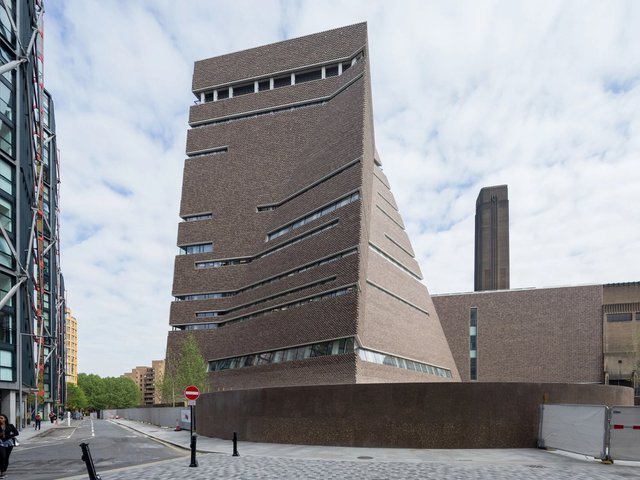
Many buildings become obsolete and decline before a new cycle of reappropriation resumes the process for a new generation. The new Tate Modern in London is a dramatic example of this cycle of change, from a previously essential resource, a power station constructed between 1947 and 1963 by the architect Giles Gilbert Scott, into what will surely be the most spectacualr British museum development of this decade.
It is also a major opportunity for the Swiss architectural practice Herzog & de Meuron, which beat off distinguished international competition from the likes of Frank Gehry, Tadao Ando and Renzo Piano to win the designing of the new gallery to house the Tate’s collection of international art from 1900 to the present. Tate Modern is their largest project to date, although the fame it has given them has led to many subsequent commissions.
Bankside has been converted into three distinct zones: the switching station, which remains in use by the electricity board; the central five-storey volume of the Turbine Hall, which accommodates entrance and reception area, book shop and sculpture space, and the adjoining seven-levels of gallery space and restaurant located within the old Boiler House fronting onto the Thames. A new footbridge crossing the river, by Norman Foster and Anthony Caro, is to open to the public on 10 June 2000.
Particularly evident from London Bridge and the north bank is the new, two-storey, glass penthouse above the Boiler House, which pierces the monolithic chimney stack, creating a strong horizontal dynamic to the north façade. With it, the building’s new civic identity has asserted itself beyond the confines of the existing Art Deco brick box. Elsewhere, Herzog & de Meuron’s interventions are restrained and clearly articulated.
The main entrance is on the eastern side of the building, where the visitor is deliberately squeezed through low concrete gateways into the vast Turbine Hall, top-lit against the existing industrial roof structure of gantry cranes and exposed steel trusses. The scale and dominance of the space is brave, brutal and mesmerising. The raw, wide, ramped entrance sloping down to the sculpture area acts as an extension of the street.
Only a newly constructed motorway-type bridge inhabits the Turbine Hall, dividing it into two halves, for entrance and display. Industrial, rough finished steel stairs lead the visitor up to the bridge and along to the concourse and gallery areas within the Boiler House at Second Level and above.
The sculpture space in one half of the Turbine Hall will house new, large-scale pieces commissioned each year for the next five years. The French artist Louise Bourgeois has created the inaugural work, which draws on her previous psychological installation, “Cells”.
The concourse areas, containing lifts and escalators, link the east and west galleries and are important orientation devices within the building, providing not only circulation and milling spaces for the visitor but also creating and reinforcing views down into the Turbine Hall from lightboxes which echo the scale and form of the roof structure and project high up into the volume of the Turbine Hall.
The viewing platforms are clad in backlit etched glass panels which create a series of intriguing glowing objects mediating between the two spaces and creating a theatrical dynamic between the onlooker and the overlooked. Herzog & de Meuron have described their work “as an architecture which exists only when viewers brings their experience to the process” and accordingly this is an architecture which appears honest and almost utilitarian but conceals a complexity of intent based on shifting perceptions and alternative narratives.
In contrast to the skilful architectural play evident in the rest of the building, perhaps it is inevitable that the gallery spaces seem subdued, almost alienated from the identity of the rest of the building, as their role is to facilitate rather to initiate. They are simple, top-lit boxes left deliberately stark, in contrast to James Stirling’s Clore Gallery addition to Tate Britain in the 80s.
Here again, the seemingly natural illumination from rooflights presents a hidden truth largely artificial in nature which reinforces a false reading of how one is situated in relation to the perimeter skin of the building.
In the architecture of Herzog & de Meuron, what you see is definitely not what you get, and it is interesting that they have cited the movies of Alfred Hitchcock as an influence in their work—where everything is normal, then suddenly there is a shift which reveals a new and surprising depth. Beyond the façade of their work is an intriguing interplay of spatial perception and materiality which oscillates between theatricality and mundanity, actuality and artifice, beauty and brutality, honesty and ugliness, familiarity and alienation.


